This was originally posted on cohost.
On the Market–Frankford trains of SEPTA in Philadelphia, the designation signs indicating the line and the next stop are very simple 18-panel 3×5-segment displays.
.jpg)
.jpg)
But they aren’t merely square segments! Each square may be subdivided into subsegments of triangles or quarter circles to give the the letters some ✨character✨, and so that some letters can actually fit within the grid. Taking a closer look at the segments, we can see the subsegment outlines.
.jpg)
(The N and the K are two of my favourite letters in this set — I just think the design is clever.) Combining the outlines of a sample of letters, a single panel is subdivided as follows.

This suffices to display all of the letters, digits, and punctuation needed by the MFL,
which are all letters excluding J, Q, V, W, Z; all digits excluding 7; and the punctuation :, -, '.
The letters are used mostly in the northeast Philly stations,
which are, in order towards the northwesternmost terminus:
- Spring Garden
- Girard
- Berks
- York-Dauphin
- Huntingdon
- Somerset
- Allegheny
- Tioga
- Erie-Torresdale
- Church
- Arrott Transportation Center
- Frankford Transportation Center
You’ll notice a number of these are quite a bit longer than 18 characters in length. I was curious to see how they abbreviated those station names, so I took the train all the way to the terminus and took photos of each displayed sign.
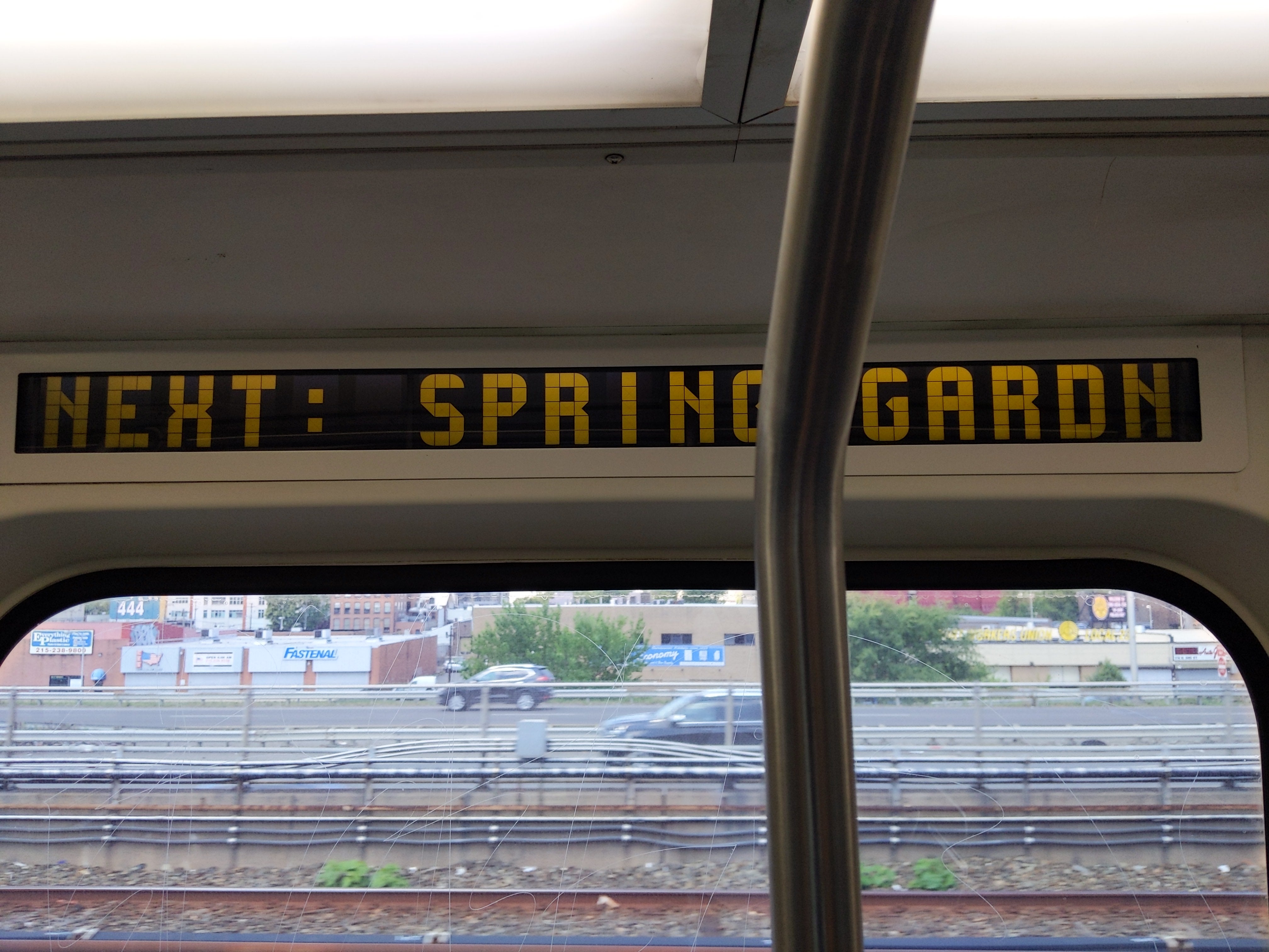 Spring Garden
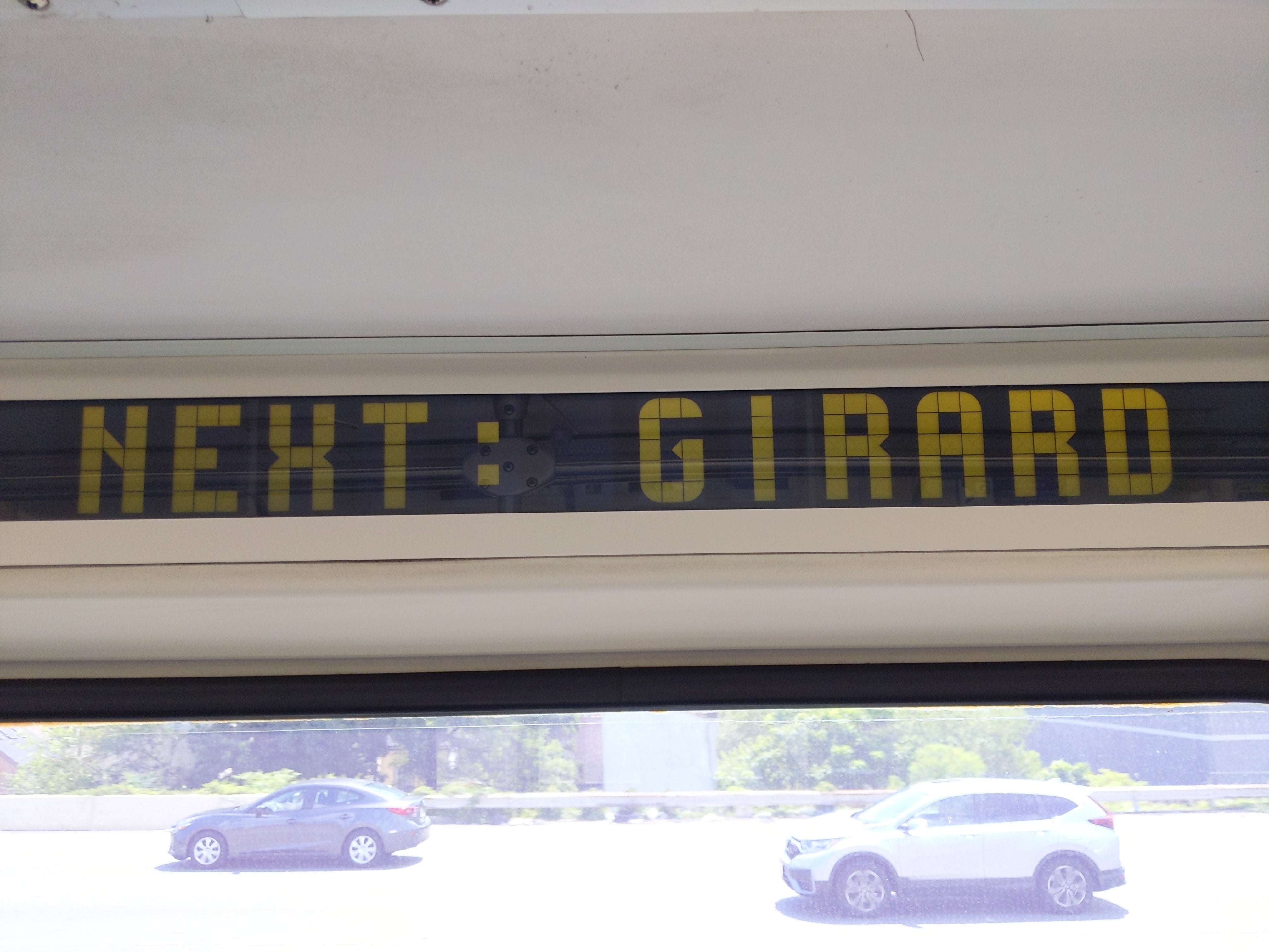 Girard
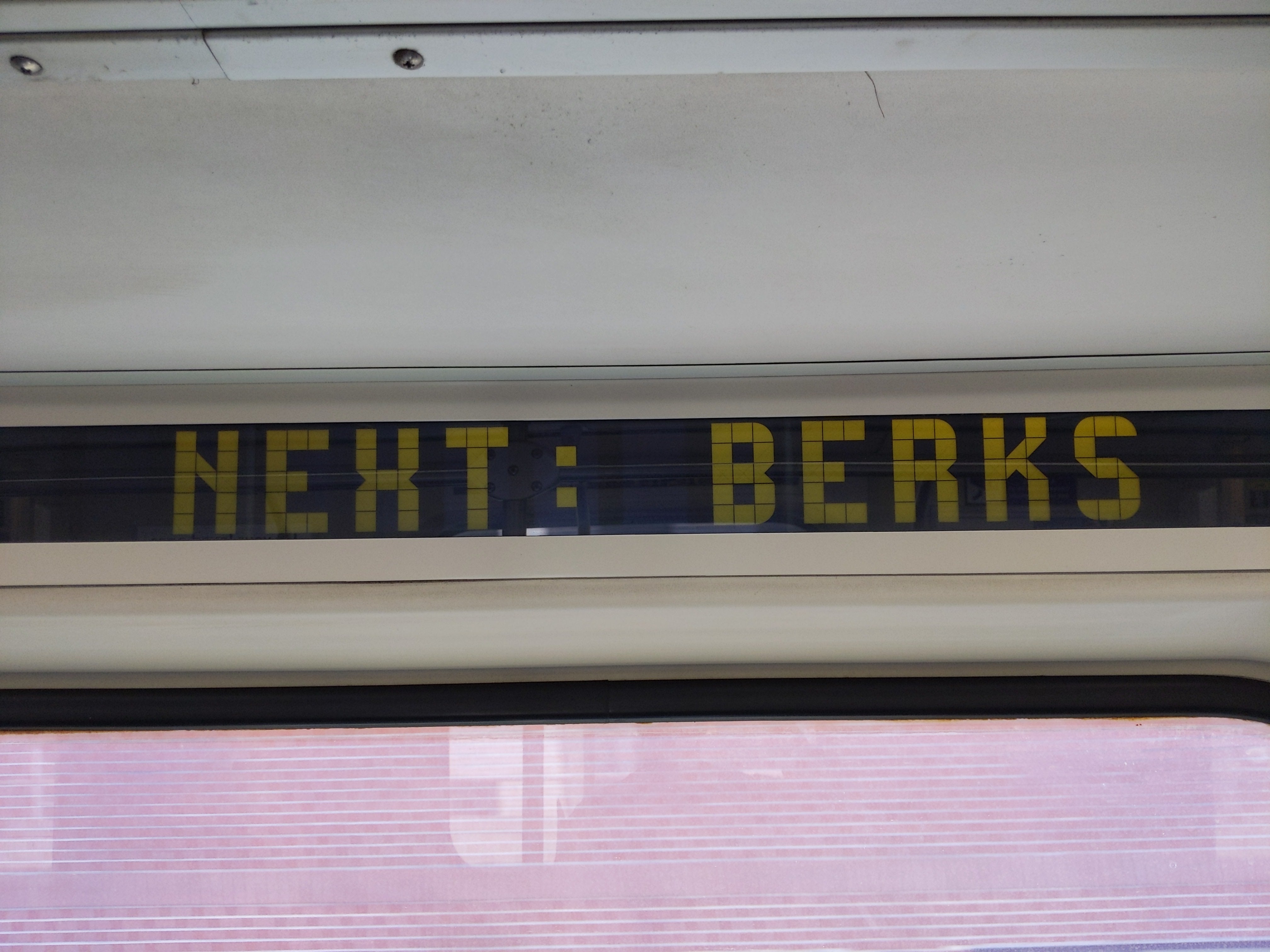 Berks
Berks
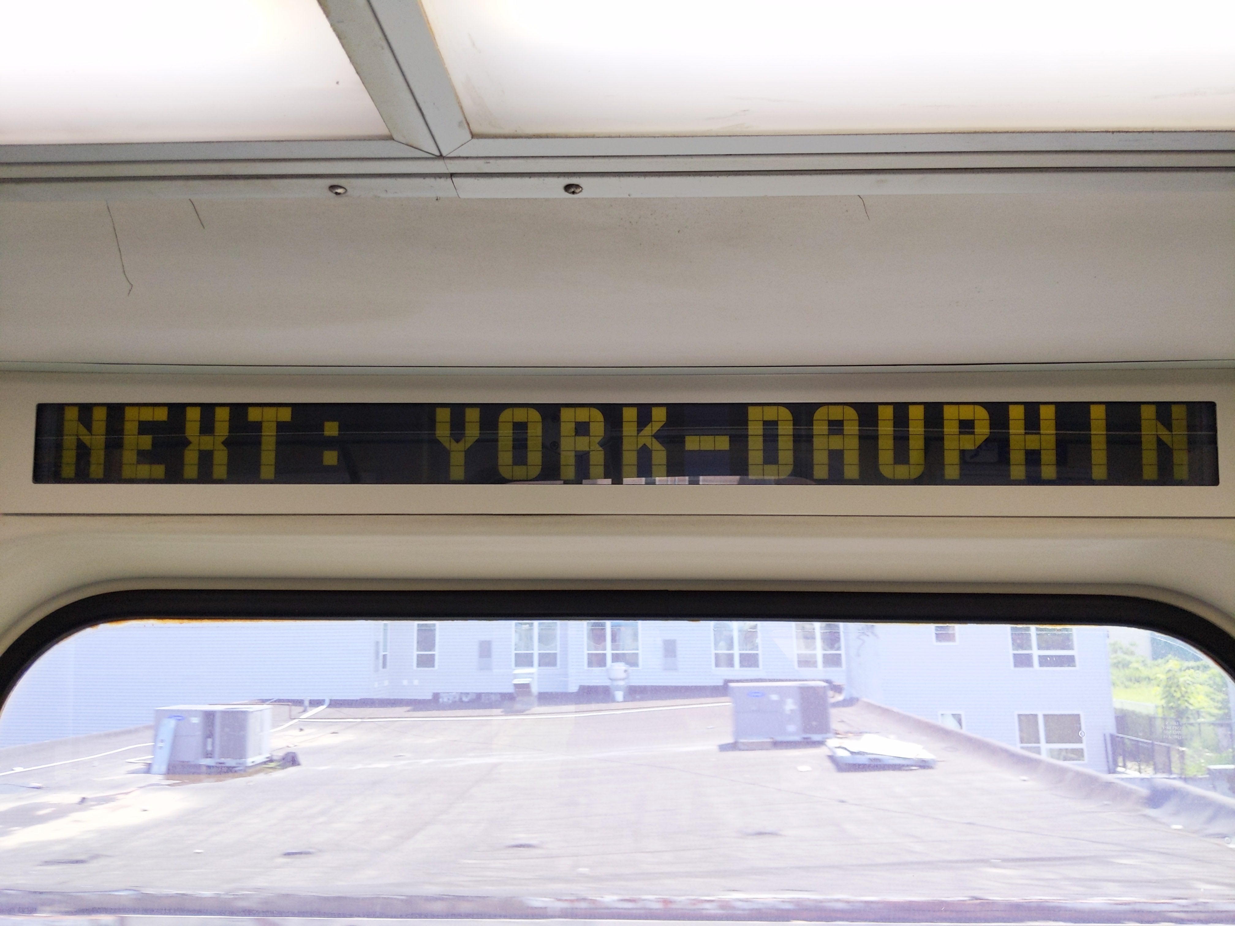 York-Dauphin
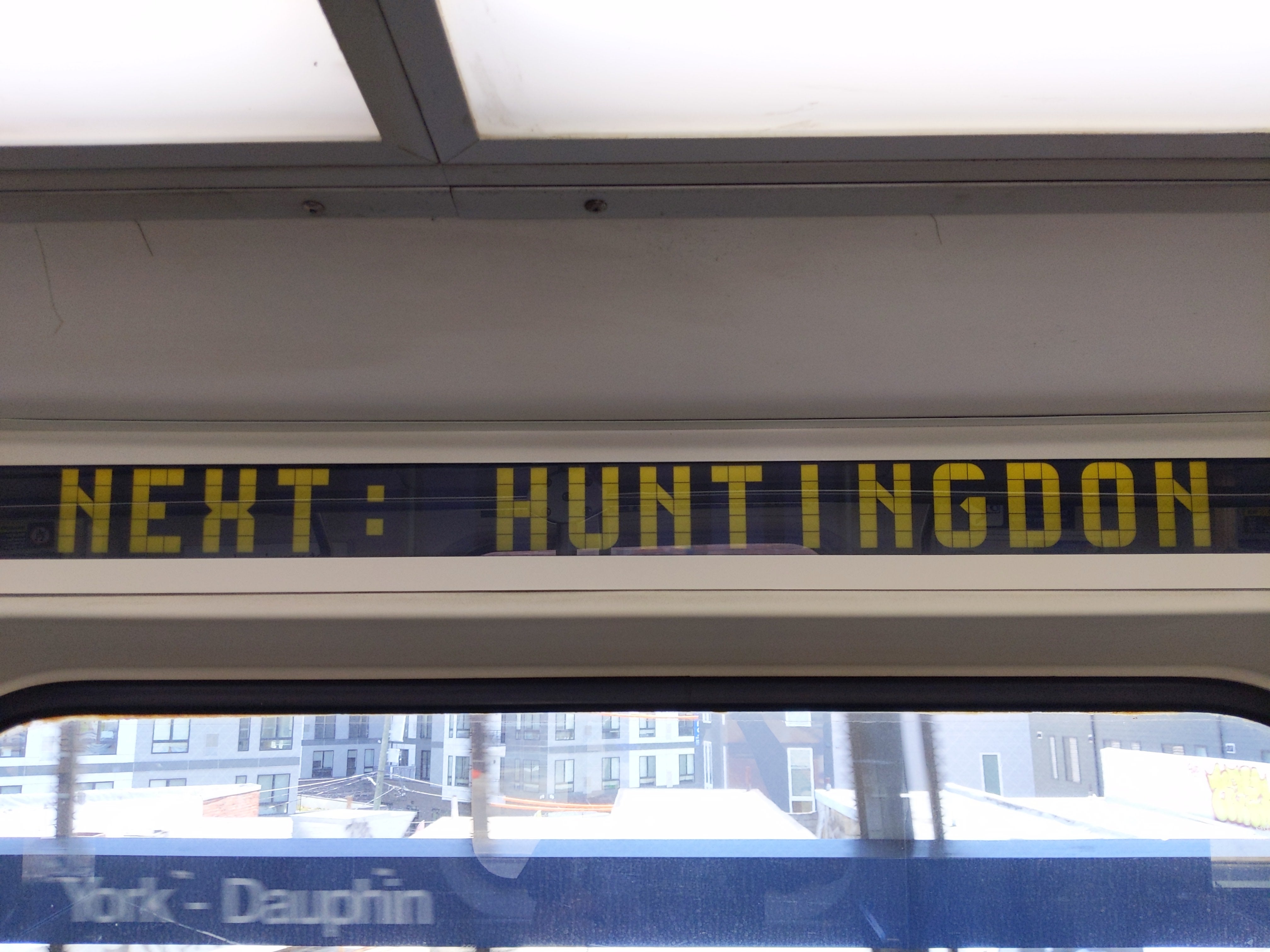 Huntingdon
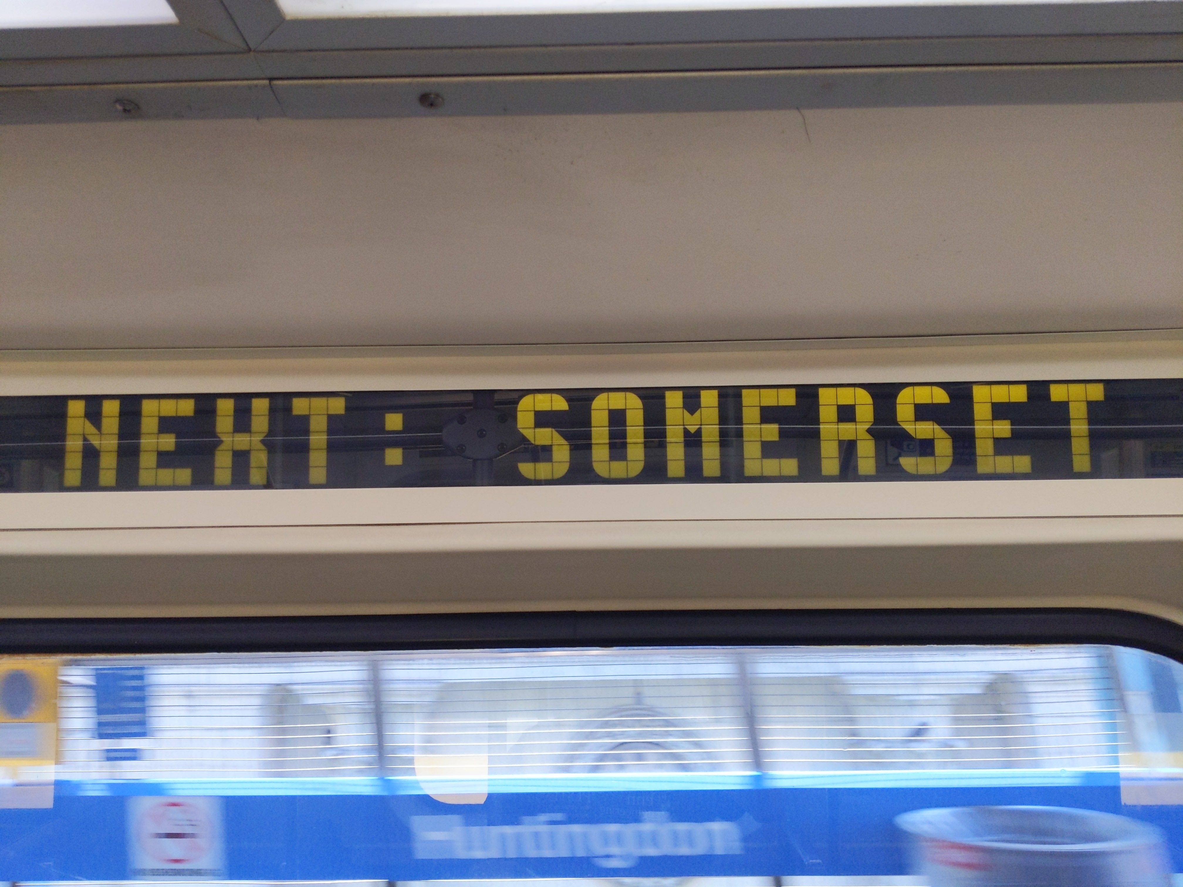 Somerset
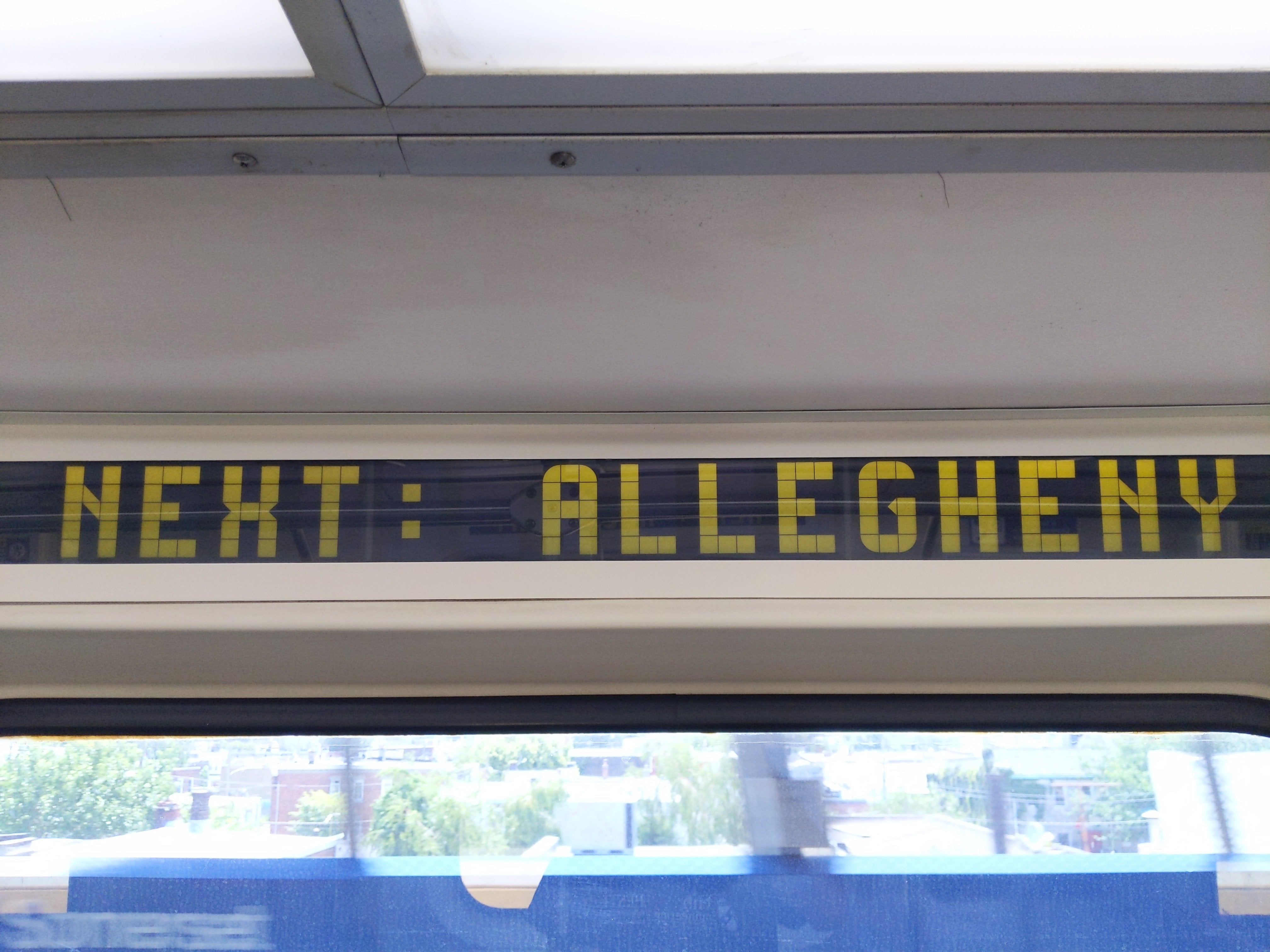 Allengheny
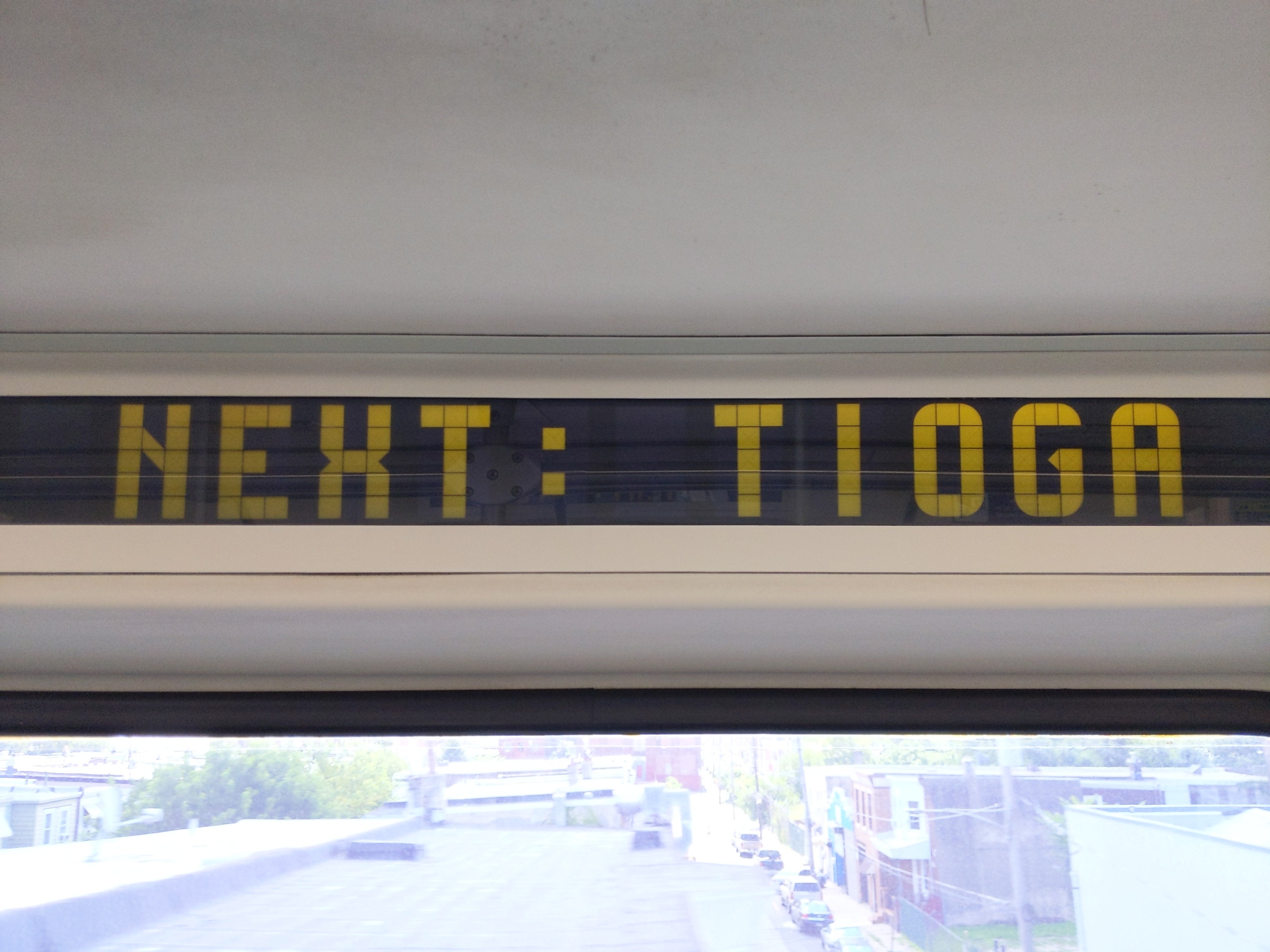 Tioga
Tioga
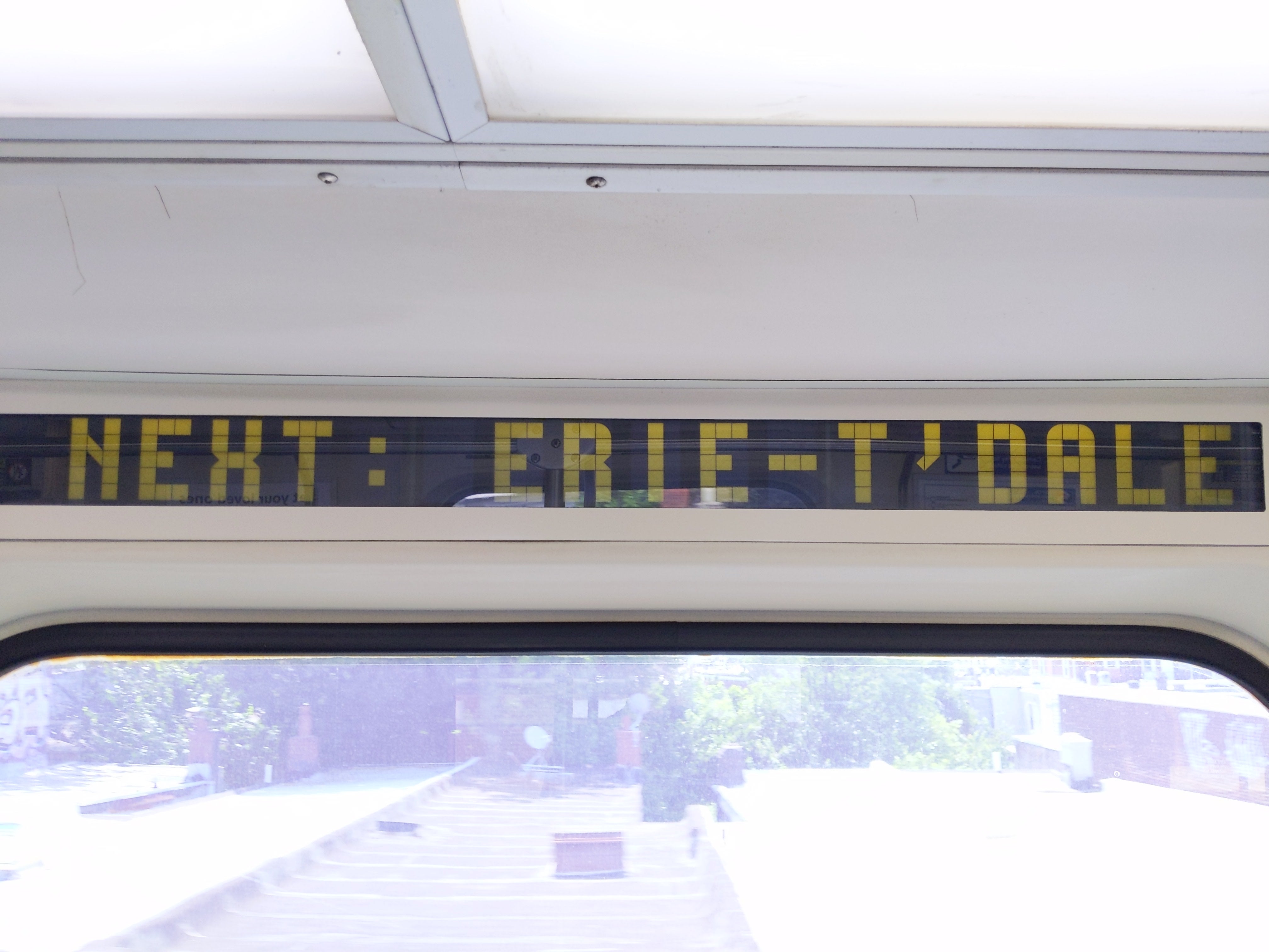 Erie-Torresdale
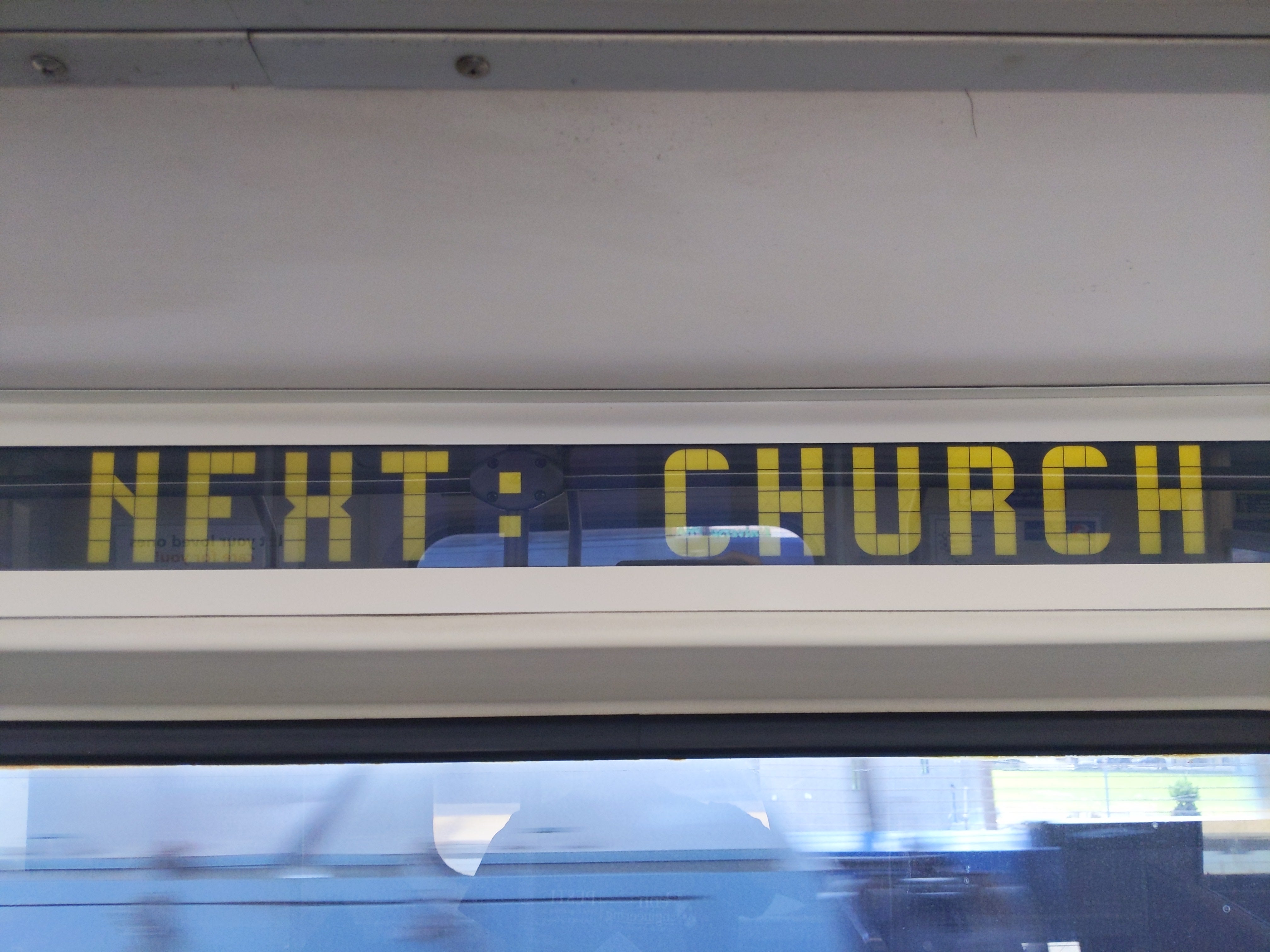 Church
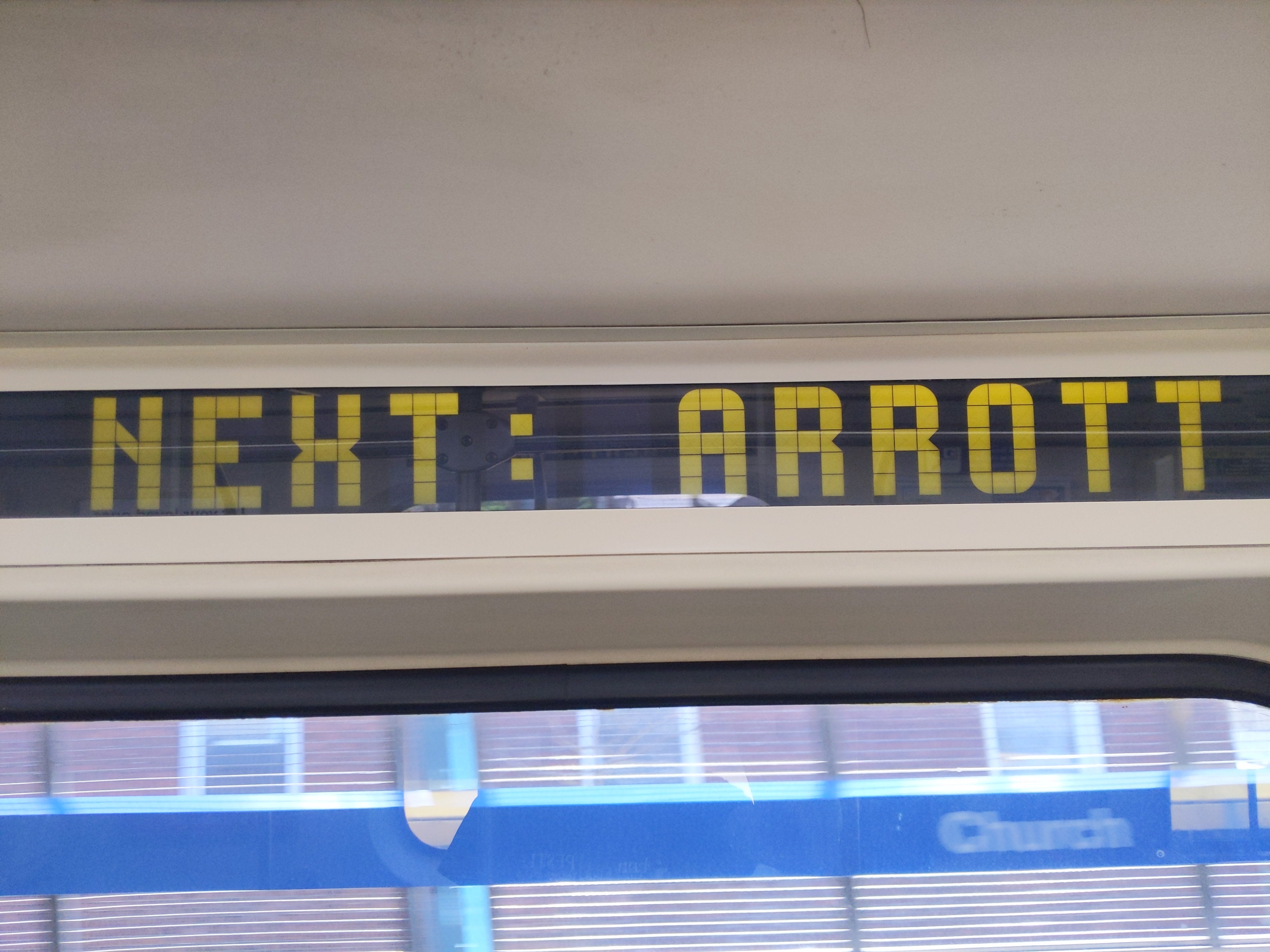 Arrott Transportation Center
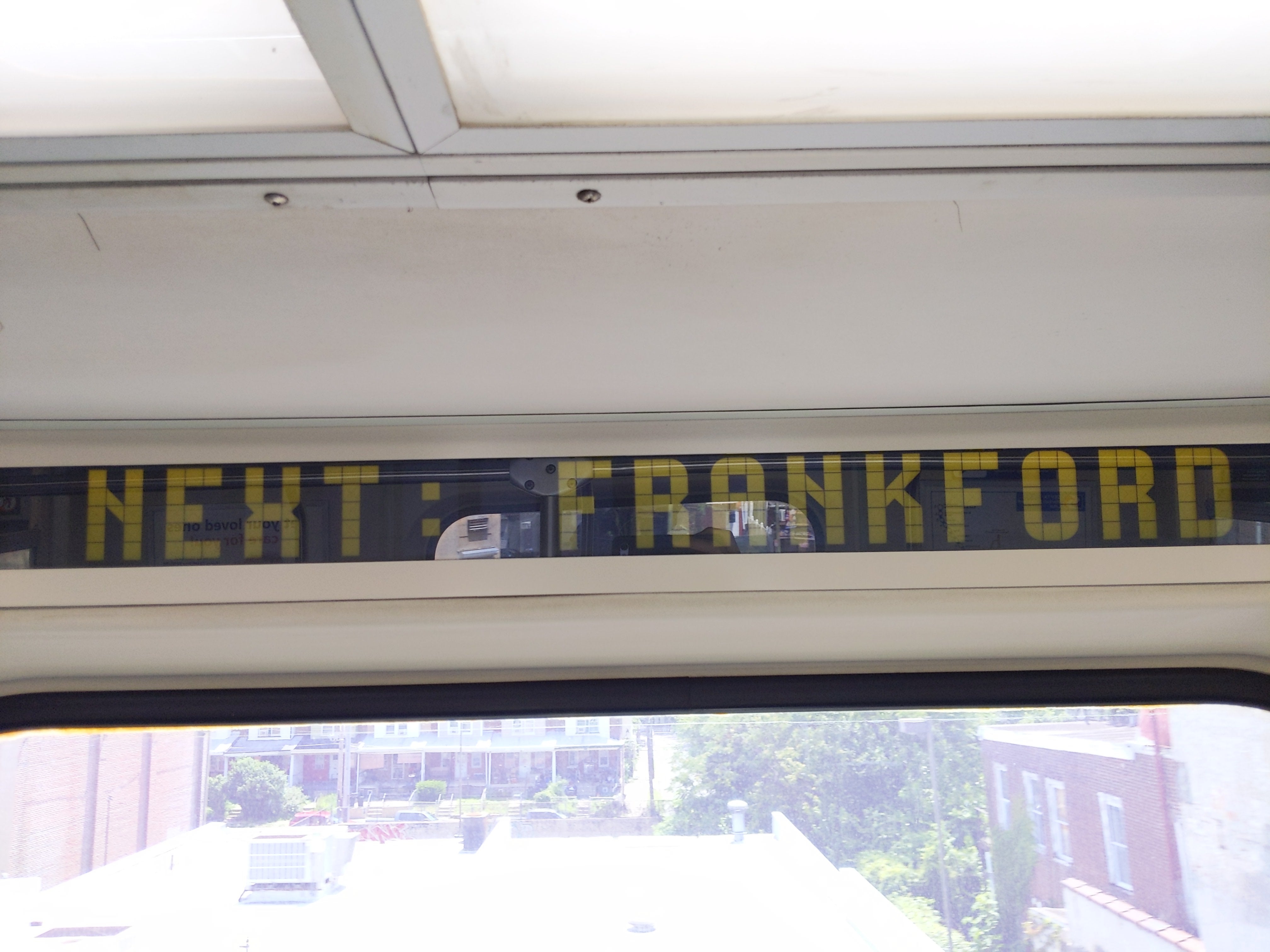 Frankford Transportation Center
York-Dauphin fits beautifully and fills all 18 panels;
poor Erie-Torresdale has a third of its name abbreviated away;
Spring Garden very nearly fits but does away with one letter (as does ALL STOPS - FRANKFRD).
From these signs, I’ve recreated all of the letters, digits, and punctuation used1, and also speculated on what J, Q, V, W, Z, 7 might look like. I’ve taken the J, V, W, Z from the San Francisco Muni Metro’s LRV4 designation signs, while I haven’t found a sample for Q or 7.

Personally, though, I would have made some of the digits a little more distinctive…

- 0 contains a marking in the middle to distinguish from O
- 1 has a hook and a foot to distinguish from I
- 4 has a cut corner in the middle left to match the other digits
-
Iomitted because it’s identical to 1; yes, I knowOis also identical to 0, ↩


