


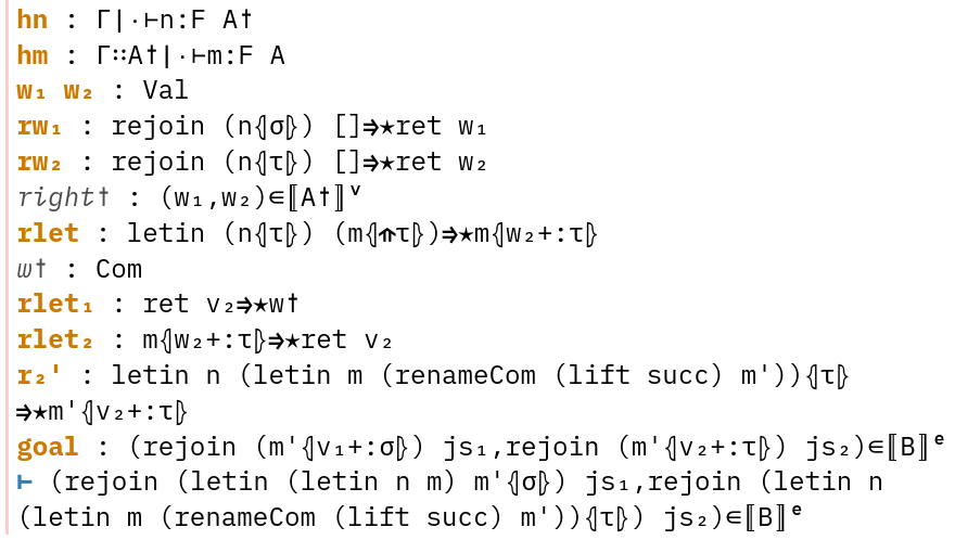
There are a lot of nice monospaced code-writing fonts that I don’t use. For some of them, there are tiny, specific nitpicks about why I don’t use them. My use case is writing code with a lot of Unicode, like in Lean or Agda, writing Markdown with a lot of Unicode because I can, and having a terminal that looks nice. For reference, I’ll be comparing a snippet of a proof state I have open at the moment, and my default font of choice is currently Fira Code.
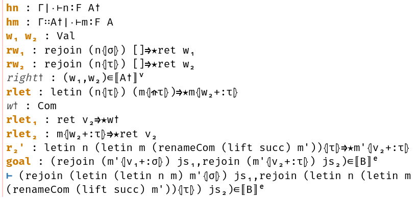
Fira Code
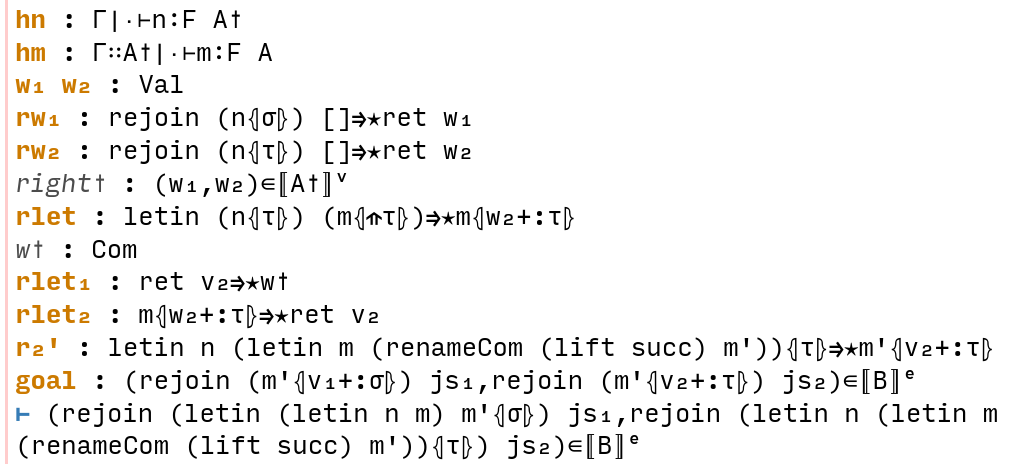
Source Code Pro
This was my default before Fira Code!
Unfortunately, it doesn’t support ligatures.
I know having both ligatures (e.g. for =>) and Unicode symbols (e.g. ⇒)
is recommended against for ambiguïty, but I haven’t been confused so far,
and it’s nice to look at.
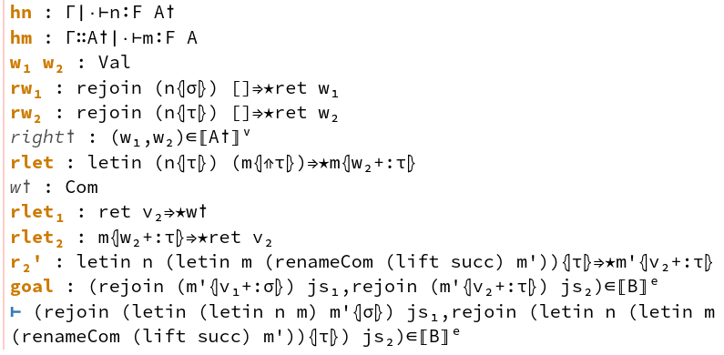
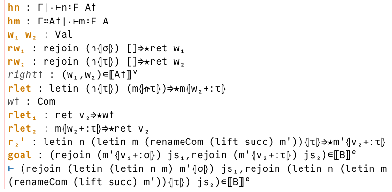
Julia Mono

This is the monospaced font I use for code on this website
because it has excellent Unicode support.
It looks very nice to me on these blog posts,
but it seems a little too… round?
(just look at that swanky τ!)
and I prefer something more neutral for everyday code.
It is, however, my next fallback font for when Fira Code is missing a character.
Atkinson Hyperlegible Mono
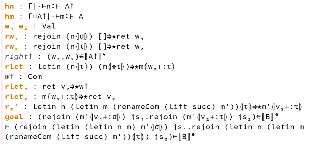
I use Atkinson Hyperlegible as the main sans serif font on this website. Their focus is on legibility, so their monospaced font is too wide for my taste. There also isn’t too much support for symbols — a lot of these in the screenshot are from the fallback font.
Iosevka
I’m very fond of Iosevka, especially with its two-column wide symbols. I use the slab variant when typesetting code in papers; the narrowness of these fonts helps save horizontal space. However, I find it too narrow for everyday writing, so for now it only features in my papers.
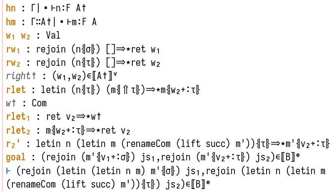
JetBrains Mono

The symbols here are a bit too wide and crowd the letters,
in particular ⊢ and ⇒, while ⋆ is indistinguishable from a cdot.
I’m not sure what’s going on with the top-open ⇑ there,
while all of the bottoms of l, j, t, etc. look too flattened.
IBM Plex Mono
I use IBM Plex Sans as my default sans serif font,
but I really don’t like how angular the monospaced font is,
in particular the angles of j and t.
Input Mono
I can’t explain it, but something about it looks too uncanny to me.
It’s like a sans serif font in disguise.
The ascenders are also way too short,
in particular the squishedness of the f.
Commit Mono
I recently learned about Commit Mono, which has a neat “smart kerning” feature that adjust the spacing between letters dynamically while still retaining fixed-width columns. Surprisingly, the letters shifting around is imperceptible to me and hasn’t bothered me at all. Unfortunately, I’ve had some troubles getting it right in Kitty (and I have a livetoot thread on this), so if I do use it, it’ll stay confined to VSCode until I can fix those issues.
Pragmata Pro
I can’t afford that.